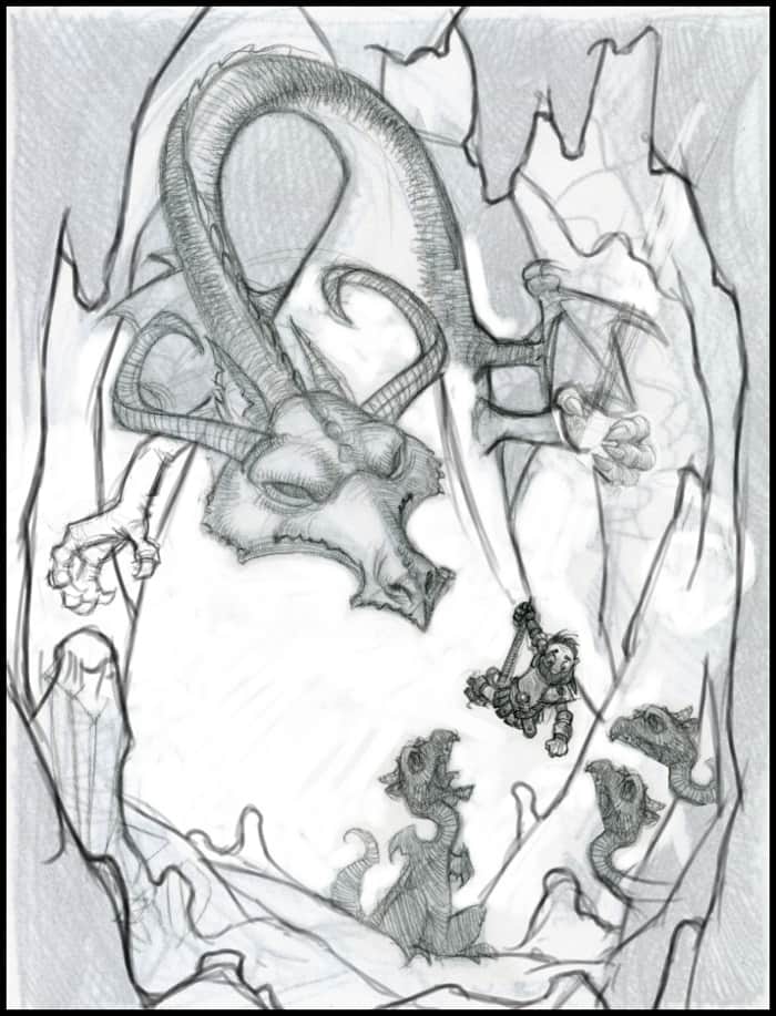
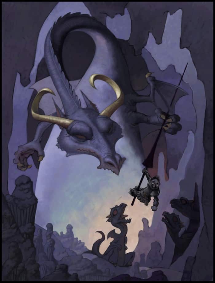
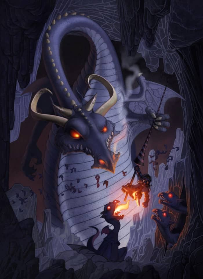
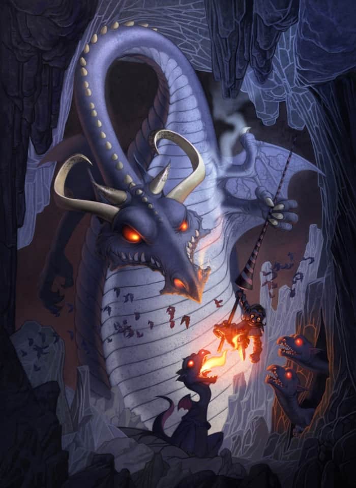
Unlike many of my digital paintings, the idea for this painting was roughly based around the concept of, "the wisdom of the elders being passed down to the youth." I started by sketching different variants of the original idea and then eventually worked my way towards birds feeding their young. While it doesn't convey the original idea exactly, I felt that, thematically, it was close enough, so I decided to go with it. I did, however, switch from birds to dragons. Instead of dragons feeding worms to their young, it seemed more likely they would use defeated knights. Hence, the final idea for the painting was born.
At the start of the sketch, I didn't have a title. The title came to me only while painting the image. Similar to a real s'more, the poor knight character is like a warm marshmallow sandwiched between layers of crispy armor. Sometimes the title of a painting just happens that way.
I created my initial sketches using colored pencils on a piece of paper. To use the sketch in Painter, I scanned the drawing at 200 dpi, saved it as a PNG file, and then opened it in Corel Painter 12.
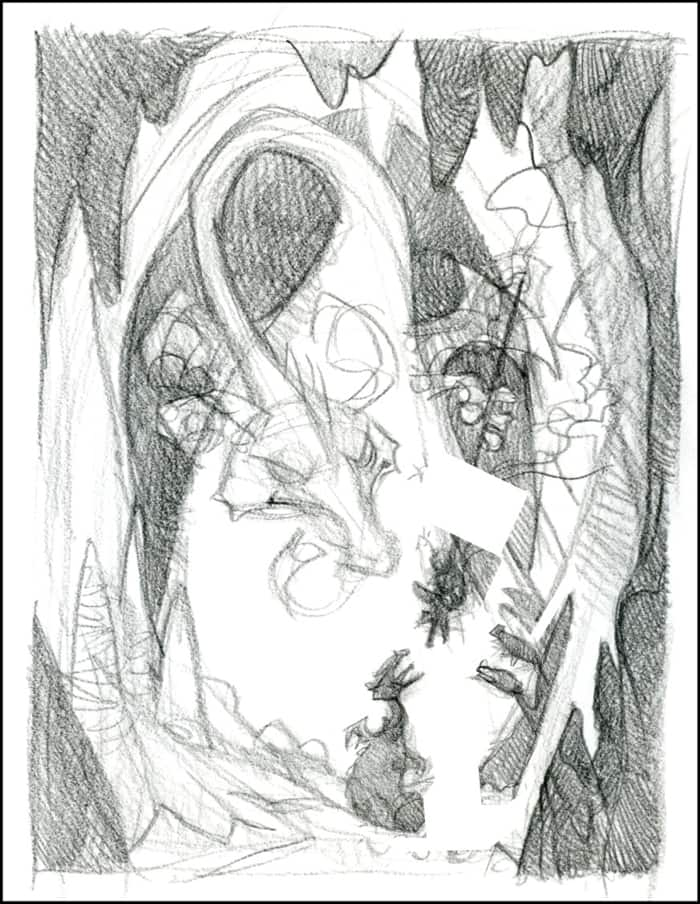
I am a bit old fashioned and, most of the time, I sketch with paper and pencils. Occasionally, I draw directly in Painter 12 using some of the pencil brushes. This allows me to work faster because it eliminates the scanning process. The pencils, and other brushes, are accessible from the Brush Selector which is located in the top-left corner of the drawing window. I click the Brush Selector to expand and select tools. My personal favorite is the Real 2B Pencil brush (Pencils category).
I use the Real 2B Pencil (Pencils category) to redraw and refine the original sketch. This step is to ensure that I have a clear vision of what I will be painting. At this stage, I do not hesitate to make major changes. I sometimes redraw, cut, paste, and transform various areas of the original drawing.
When the drawing is satisfactory, I save the image by using Iterative Save (File > Iterative Save or Ctrl + Alt + S (Win) Cmd + Opt + S (Mac)). The Iterative Save feature tracks the changes that I make to a file by saving multiple versions of the file. Every time I save, a new file is created with a number attached. From this point forward, I use Iterative Save right before and after I make any significant changes to the painting. I also save a new image after working about 30 minutes without saving. It is not uncommon for me to have approximately 100 different saved versions of each painting.
In preparation for the next step, I resize the image so it's about 1000 pixels in the largest dimension. I find it easier to work with a smaller image when doing the early painting simply because it is less work. As I begin finishing the image, I gradually increase the size of the painting. The brushstrokes that I paint early in the process tend to blur as I increase the size. This is not an issue in the final painting.
The first real brushstrokes that I apply to the painting are to get rid of the white in the image. White is distracting and it makes all of the other colors next to it look dark. Therefore, covering the white with value and color is an essential first step. This also gives me an early idea of how my finished painting will look like. It is much easier to make color and value changes early in the painting process. Even with the powerful adjustment tools available to the digital artist, it takes significantly more effort to make color and value changes late in the painting process.
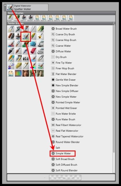
I use a variety of ways to get rid of the white in the initial sketch. One of my favorite ways to establish the colors and values in a painting is to use the Digital Watercolor brushes. Digital Watercolor brushes cover the image with transparent colors, which allow me to quickly establish color schemes and value harmonies. Unlike traditional watercolor, I can use them to paint back into the Digital Watercolor with lighter colors. The lighter brushstrokes replace any darker ones. I can also interactively adjust the wet fringe and diffusion of the strokes. The diffused strokes spread into the active paper texture.
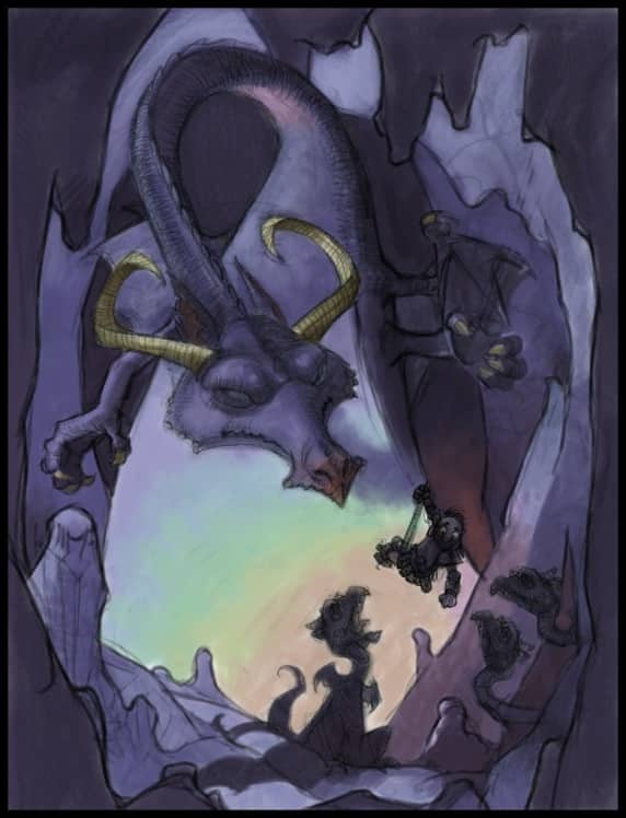
I establish a color scheme and value range in the painting by using the New Simple Water brush (Digital Watercolor category). At this stage, I work quickly with the large brushes and I'm not concerned with details. I zoom out frequently to view a small display of the painting because it allows me to evaluate how the color and values interact at smaller sizes. I press Ctrl + (Win) or Cmd + (Mac) to zoom in and Ctrl- (Win) or Cmd- (Mac) to zoom out.
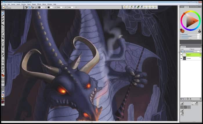
Once I'm finished establishing the original colors and values, I dry the Digital Watercolor layer by choosing Layers > Dry Digital Watercolor. Once the Digital Watercolor layer is dry, I can no longer make adjustments to the Diffusion and Wet Fringe settings. During this stage, I continue making drawing adjustments. In this example, I drew the knight's lance. I completed all of the work on the canvas layer.
Now that the color scheme and values are set, I start painting on the image. I use a variety of custom and default Painter brushes, as well as custom and default Painter papers.
I listed some of my favorite Painter 12 default brushes in the following table:
| Brush category | Brush variant |
| Chalk and Crayons | Variable Chalk |
| Oils | Opaque Round |
| Acrylics | Captured Bristle |
| Airbrushes | Digital Airbrush, Variable Splatter, Pepper Spray |
| Pencils | Real 2B Pencil |
| Pens | Calligraphy Brush |
| Gel | All variants of the Gel category |
In this painting, I worked mostly with the Painter 12 default brushes listed above. However, I did vary the size and opacity of the default brushes by making adjustments from the property bar. I also worked with brushes that I created from scratch. I created the custom brushes to do specific things; I did not cover the creation of custom brushes because it is beyond the scope of this tutorial.
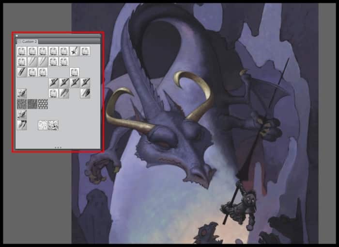
In Painter 12, one of the great features is the ability to create custom palettes. Custom palettes let me store the tools that I use most and keep them within easy reach. I can quickly create a custom palette for my brushes by holding down the Shift key, and then dragging an individual brush variant from the Brush library panel to the drawing window. The brush variant is automatically added to the new floating palette. I use the same process to add additional brush variants to the palette. I can also drag paper textures, patterns, weaves, almost anything to a custom palette. If I happen to drag something to a palette by mistake, I can remove it by holding the Shift key and dragging it off the palette. If I want to rename a custom palette, I can open the Custom palette organizer by clicking Window > Custom palette > Organizer. Custom palettes definitely help speed up the painting process.
I now create a new layer and start refining the underpainting by adding additional details and changing parts of the original sketch. The main brushes that I use during this stage of the painting are the Opaque Round brush (Oils category), Captured Bristle brush (Acrylics category), and Calligraphy brush (Pens category). I vary the opacity and size as needed. I start painting the stalactites and stalagmites in the foreground, as well as other parts of the cave, the individual dragons, and the poor knight. As the image progresses, I will make many more changes. I work from large and simple objects, down to the small and detailed areas. Much of my color is now set and I use the Dropper tool to pick up colors from within the existing image. I press the D shortcut key to access the dropper.
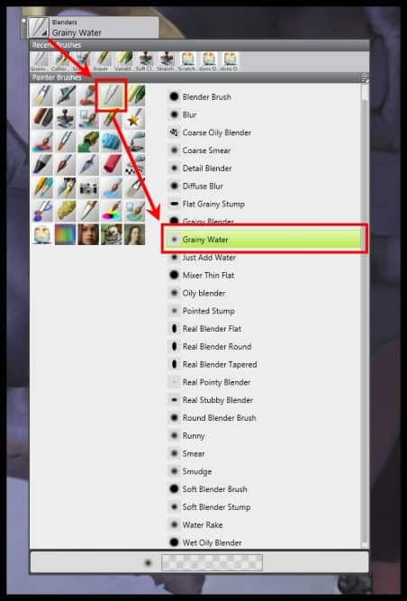
When I paint the image, I perform a lot of subtle blending. One of my favorite blending brushes is the Grainy Water brush (Blenders category), which is a Painter 12 default brush.
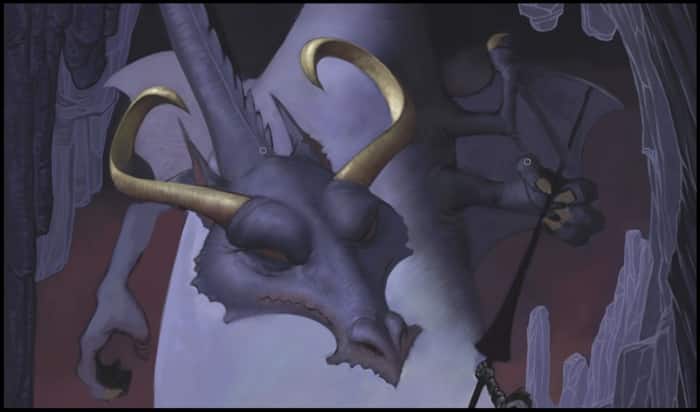
I set the Grainy Water brush to 30% - 50% opacity to blend colors and edges together. I like this blender because it allows me to see brushstrokes and it doesn't blend too evenly. I am not terribly concerned with the edges of objects so this brush blends the colors nicely. It also interacts nicely with the paper texture. I captured the results of the blending in Figure10.
The hardest, and most time-consuming, part of the entire painting process is the middle part. It has no specific start or end, but I spend a great deal of time painting at this stage. I often make major and/or minor changes, and bring the whole painting closer to finish. In general, most paintings don't look good at this stage because they're incomplete. As a result, artists may sometimes feel like their painting is a wasted cause and are tempted to abandon their work. Now, however, is not the time for an artist to quit!
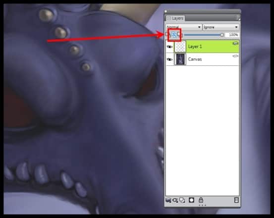
I am going for the final look of the dragons and the knight. I create a new layer when making changes to the characters because it allows me to experiment and easily correct my mistakes. When painting on a new layer, I make sure to click the Pickup Underlying Color button in the Layers panel so my brushstrokes blend smoothly with the canvas colors. If I don't do this, it can produce white artifacts at the edges of the painted brushstrokes. When the option is turned on, the small dropper icon is blue.
At this stage, I completed most of the painting with the Opaque Round brush (Oils category).
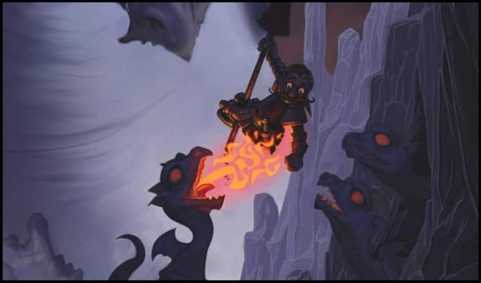
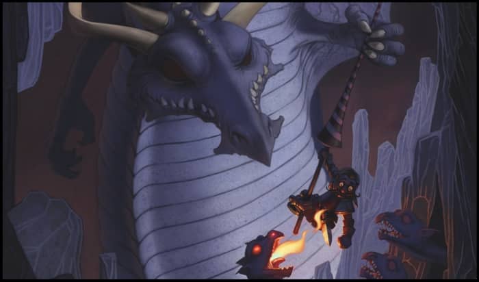
Up until this point, I did not pay much attention to the smaller dragons. I need to add fire coming out of the left dragon's mouth. S'mores are warm after all. I added the fire for the humor of it, but it's an important design element. I also use it to add a light source and color focal point in the image.
I paint additional details to the cave and the larger dragon. I also darken the foreground cave rocks so they form a visual frame for the rest of the painting. When I'm done, I save an iteration of the image using File > Iterative Save.
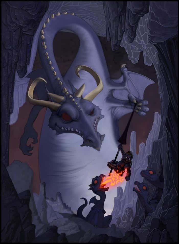
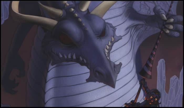
The larger dragon is looking rather boring so I decide that it needs some scales, or something on the large expanse of its stomach. I'm not completely sure what I want to do, so I create a new layer to complete all of the work. On different layers, I create several variations of scales and plates on the dragon's stomach. I choose the same default brushes that I used throughout the rest of the painting. I finally decide on the elements that I want to keep, which I captured in Figure14.
I think it adds interest and helps lead the eye around the composition.
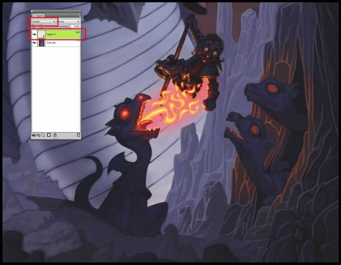
I also added a subtle glow to the cave wall around the small dragons peeking out of their den. I did this on a new layer by applying a deep orange color by using the Digital Airbrush (Airbrushes category).I then proceeded to apply the Screen composite method from the Layers panel. This erased all of the unwanted areas that had overlapping color.
The flames coming out of the small dragon's mouth are too complex, so I repaint them into one larger, simple flame.
I am now finished with most of the middle painting process. Everything, from this point forward, is what I consider the finishing stage of the painting.
One of the most important skills a digital artist can master is the use of texture. Texture can be used to do things in digital painting that would be extremely difficult, if not impossible, with traditional media. The skillful use of texture can enhance the detailed areas of a painting with very little effort.
Painter 12 includes numerous tools and techniques to create and apply textures. The most common are papers and patterns. I use both directly and indirectly to add interesting patterns and details.
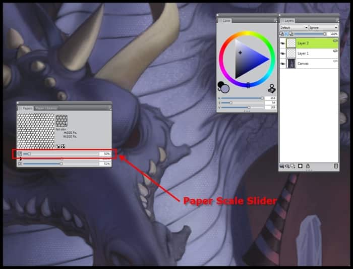
In this painting, I use textures to create a reptile-like skin texture, as well as to add subtle detailing to the cave. To add a nice reptile texture to the dragon skin, I use a custom paper texture that I created earlier from a photograph of an iguana. I did this by doing the following:
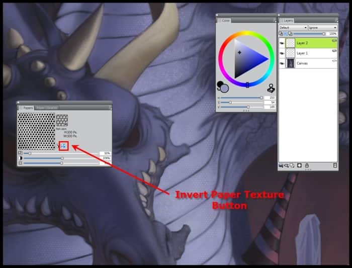
I find that this is a very effective way of creating skin textures. With this technique, I can make it as subtle or as obvious as I want. It does, however, take practice to master this technique. Therefore, do not get discouraged if any initial attempts are unsuccessful. I captured the resulting dragon skin in Figure18.
I figured that, if someone lives in a cave, they're probably not going to have many opportunities to get clean. Therefore, I added an additional texture to the painting to give the whole thing a somewhat dirty look. I make sure to add a subtle texture effect so it doesn't appear overdone. I apply two different textures by doing the following:
There are just a few things left to do to complete the painting. I need to make these small additions to add a sense of believability to the fantasy painting. I complete all of the finishing touches on new layers, so that I can experiment a bit and make corrections easily.
My first step is to add spotted tips to the horns. I do this quite easily by using the Variable Splatter brush (Airbrush category). Any overspray is simply erased since I am painting on a new layer.
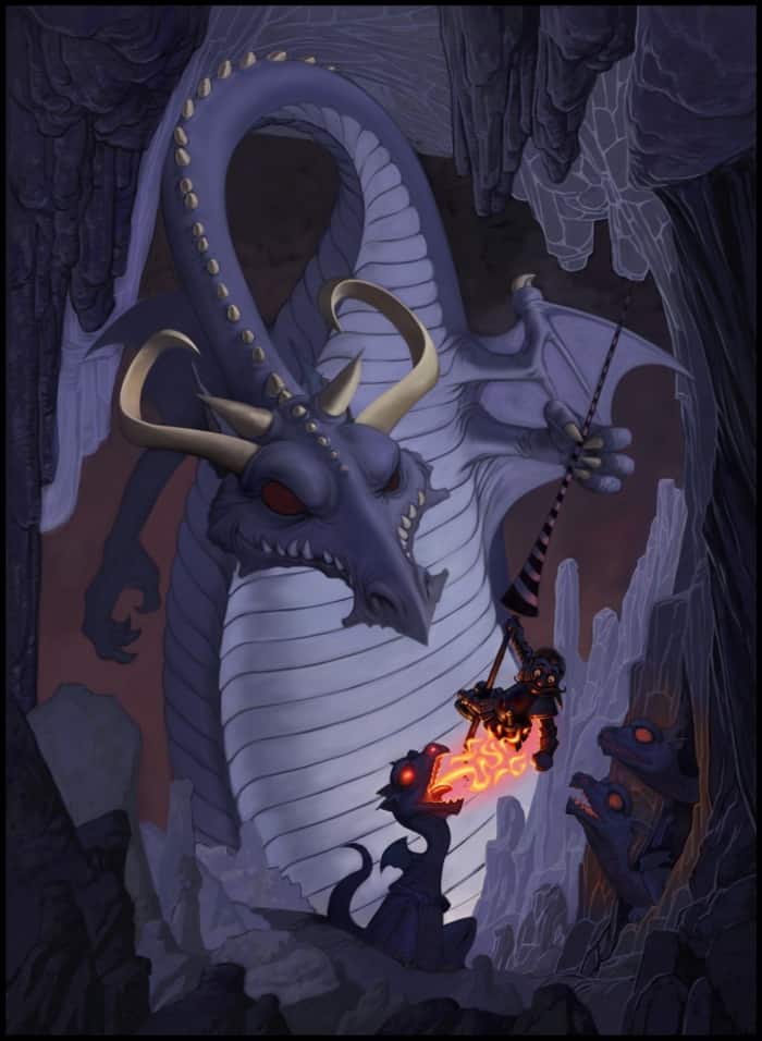
I create another layer to add orange-reflected light to the large dragon's nose and jaws. I roughly paint the brushstrokes to create the illusion that the dragon has been around for a long time and has acquired scratches and cuts. This also gives the dragon some character. The flame in the small dragon's mouth also creates additional light.
I drop the two layers containing the rim lights and horn spots onto the canvas by choosing Layers > Drop. I then save the painting by using File > Iterative Save.
I want to add some glow around the flame to enhance the illusion that the flame is a light source and add interest to this area of the painting. The following is a relatively simple method for adding a glow:
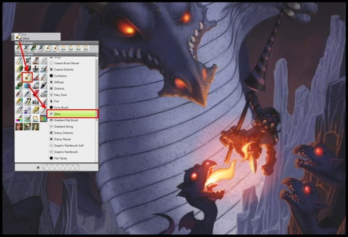
The next finishing touch is to add glow to all of the dragons' eyes. I accomplish this quite easily by using one of my favorite brushes, the Glow Brush brush (F-X category).
I find that this brush should be used with care because it can quickly become gimmicky. To add the glow to the dragons' eyes, I start by creating a new layer. I then choose a very dark, saturated orange color, and lightly paint over the dark eyes of the dragons. Once I add the general glow, I reduce the size of the brush and add the very intense and yellow highlights.
I also want to add some sparks to the flame that's coming out of the small dragon's mouth. This is also easy to accomplish. I choose the Variable Splatter brush (Airbrush category).
To add the sparks, I create a new layer and choose Screen from the Composite Method list box in the Layers panel. I then paint the sparks using a dark orange color. I also erase any sparks that fall outside of the area where I want them visible.
I save my changes by choosing File > Iterative Save. I also drop both layers onto the canvas by choosing Layers > Drop. The complete painting is almost done and looks like Figure22.
I decide to add some smoke coming out of the large dragon's right nostril. To paint smoke, I do the following:
Once the smoke looks the way I want it too, I drop the colored screen layer by choosing Layers > Drop. I then delete the original smoke layer by choosing Layers > Delete layer.
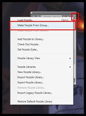
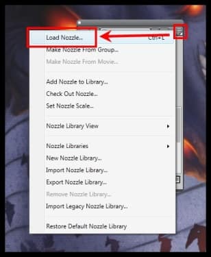
I decide that it would be interesting to add some bats in the cave. Frankly, I am not sure if they are successful, but I will include the step anyway. To paint the bats, I choose the Image Hose with a custom nozzle. The nozzle itself is not hard to create.
The added bats can be seen in Figure 26.
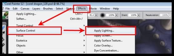
There is one last thing to do and then I am done with "S'mores". I want to add some color variety to the whole image. A very easy way to do this is by using the Apply Lighting dialog box. I open the dialog box by choosing Effects > Surface Control > Apply Lighting.
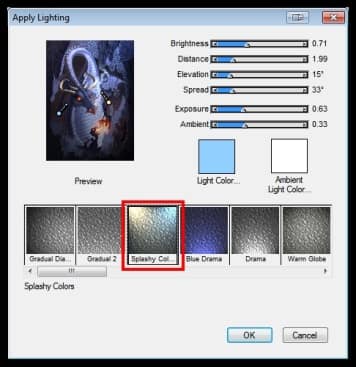
Before applying the lighting effect, I copy the whole painting by pressing Ctrl + A (Win) or Cmd + A (Mac) and paste Ctrl + C (Win) or Cmd + C (Mac).This creates a duplicate copy of the painting. I then apply the lighting to the duplicate and adjust the opacity to my liking.
With the duplicate layer selected, I choose Effects > Surface Control > Apply Lighting and choose the Splashy Colors preset setting.
In the Layers panel, I lower the Opacity slider for the layer to about 50%, so that a subtle shift in color and value is now present in the final painting. When the layers are blended just right, I drop the layer onto the canvas.
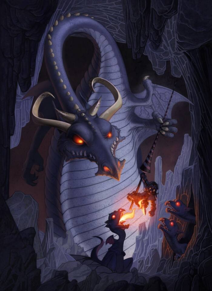
"S'mores" is now finished and complete.
Don Seegmiller has been painting professionally for over 25 years. He is a Corel Painter Master, Brigham Young University and CGSociety instructor, author and professional illustrator with work featured in many major art galleries. The majority of Don's traditional work is handled by Wadle Galleries Ltd. of Santa Fe. Learn more about Don at: http://www.seegmillerart.com/.